Designing a scalable visual system to organize and differentiate content across vertical and horizontal video formats
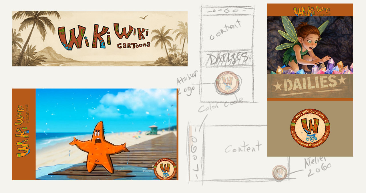
Multi-format identity system spanning vertical and horizontal video, from concept sketch to deployed assets.
Problem
As the channel expanded into multiple content streams, content lacked clear differentiation. Without consistent visual signals, viewers had to interpret context manually, increasing friction in recognition and navigation.
Constraints:
• multiple content domains within a single channel
• mixed formats (vertical shorts, horizontal video)
• limited platform-level control
• need for fast, repeatable production
Constraints:
• multiple content domains within a single channel
• mixed formats (vertical shorts, horizontal video)
• limited platform-level control
• need for fast, repeatable production
Goal
Establish a system that reduces ambiguity and scales with production.
The system needed to:
• make content type immediately recognizable
• remain consistent across formats
• support high-frequency output without redesign
• reinforce a single, coherent identity
The system needed to:
• make content type immediately recognizable
• remain consistent across formats
• support high-frequency output without redesign
• reinforce a single, coherent identity
Approach
Designed as a multi-format system rather than a single layout adapted across contexts.
Multi-Format Design System
Two primary contexts:
Vertical — Shorts / Dailies
Optimized for mobile: minimal overlays, fast readability, strong hierarchy.
Horizontal — Long-Form
Supports wider composition: integrated overlays, titles, and longer pacing.
• format-specific layouts
• shared visual rules across both
Consistency is maintained at the system level, not the layout level.
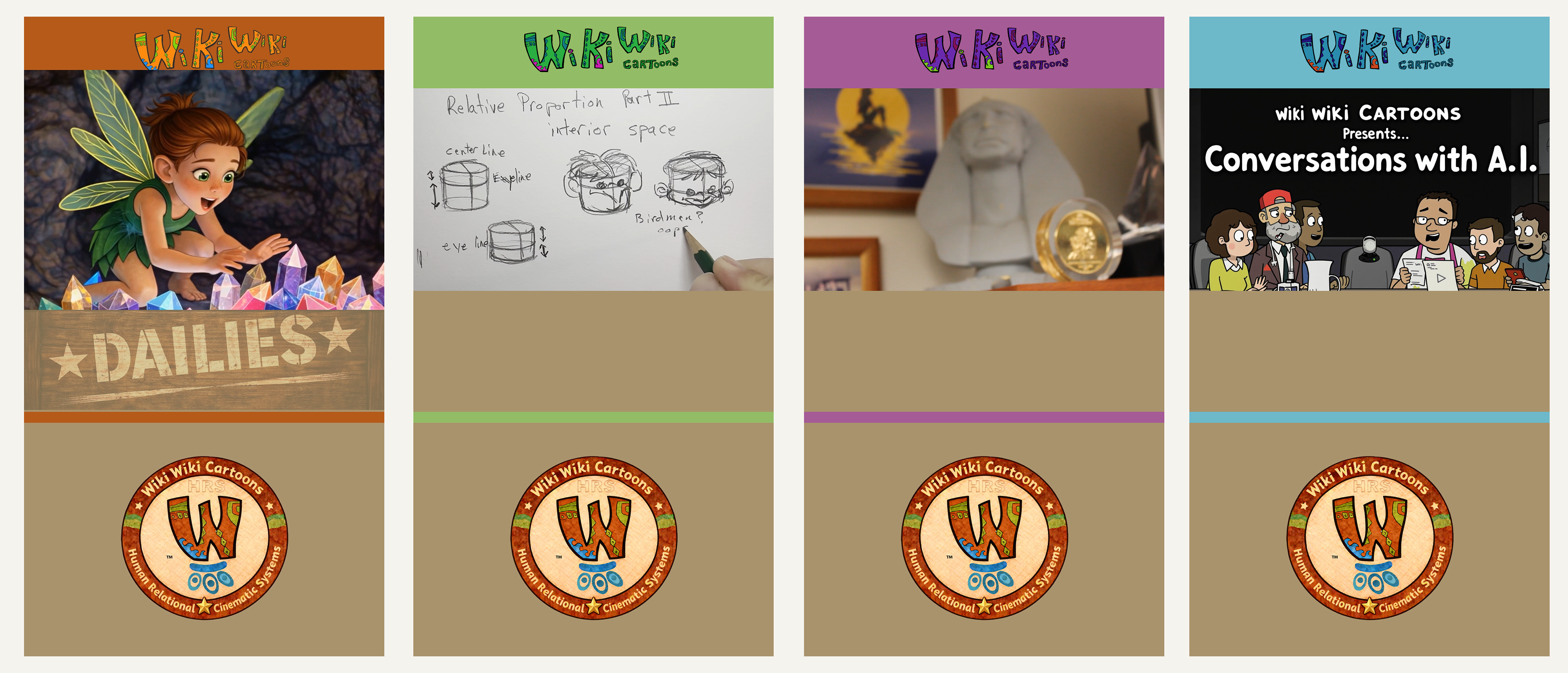
Content Organization Through Color
Color is used as a structural signal to differentiate content domains.
• Atelier (Life & Lore) — behind-the-scenes, process, and industry context
• How To — instructional content in drawing and animation
• Content — original animated series and narrative programming
• Research — academic work, findings, and AI-focused discussions
• How To — instructional content in drawing and animation
• Content — original animated series and narrative programming
• Research — academic work, findings, and AI-focused discussions
Each domain is assigned a consistent color treatment:
• applied across vertical and horizontal formats
• enables immediate recognition without relying on titles
• reduces cognitive load for returning viewers
• scales as new content is added
• enables immediate recognition without relying on titles
• reduces cognitive load for returning viewers
• scales as new content is added
Color functions as both identity and routing across the channel.
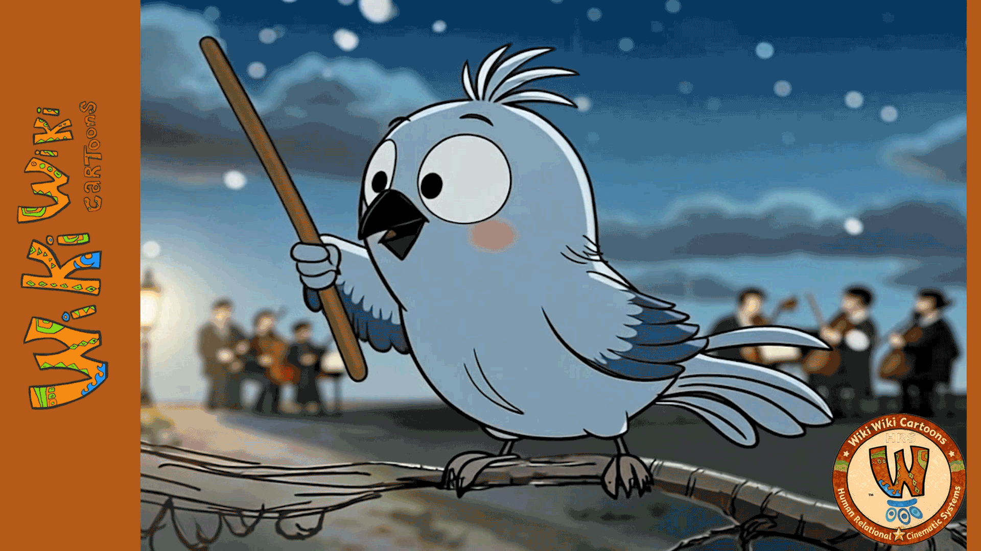
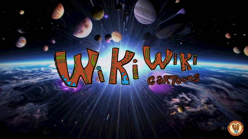
Brand Extension & Motion Identity
Extends static branding into reusable identity components.
• logo integrated across all formats
• Atelier stamp introduced as authorship marker
• overlay placement standardized
• intro/logo sequences developed for reuse
• Atelier stamp introduced as authorship marker
• overlay placement standardized
• intro/logo sequences developed for reuse
These elements establish continuity across independent uploads.
System Design
The system operates across three layers:
• Visual Identity — color, type, overlays
• Content Architecture — domain structure via color coding
• Motion Identity — intros, transitions, title moments
• Content Architecture — domain structure via color coding
• Motion Identity — intros, transitions, title moments
Each layer is independently defined but works as a single system.
Process
Developed as a production-aligned system, not a one-off design.
• defined content domains
• established format-specific rules
• extended branding into overlays and stamp system
• produced reusable motion elements
• deployed across active channel content
• established format-specific rules
• extended branding into overlays and stamp system
• produced reusable motion elements
• deployed across active channel content
The process prioritized repeatability over customization.
Role
Focused on system definition and implementation.
• content system design
• visual identity development
• multi-format layout strategy
• motion identity production
• system integration into workflow
• visual identity development
• multi-format layout strategy
• motion identity production
• system integration into workflow
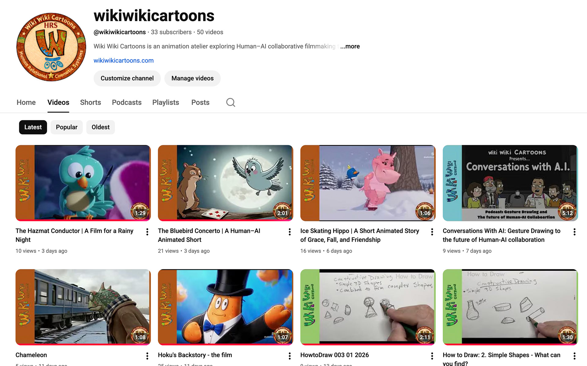
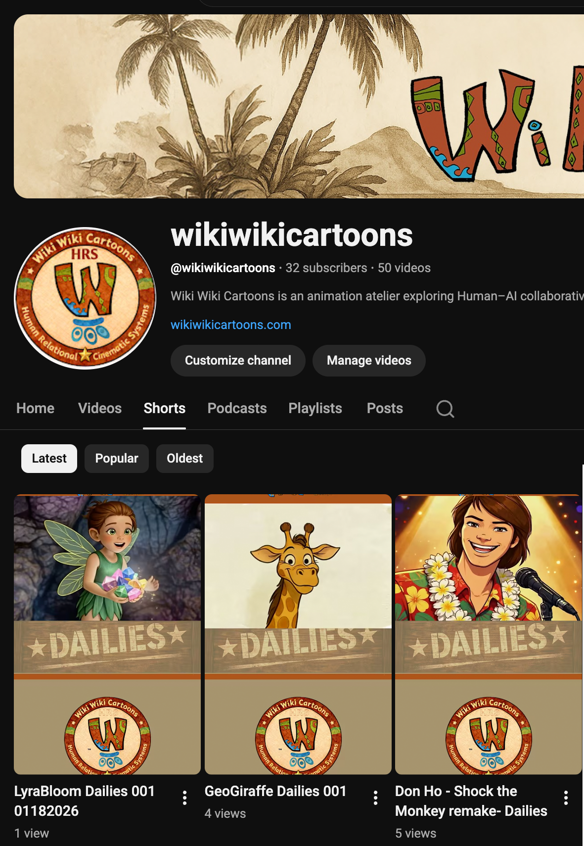
System deployed across YouTube: horizontal video grid (top) and Shorts feed (bottom), demonstrating consistent identity and format-aware adaptation.
Outcome
• content types are visually distinguishable without text
• consistent identity across formats
• reduced design overhead per asset
• faster production cycle
• system supports ongoing expansion
• consistent identity across formats
• reduced design overhead per asset
• faster production cycle
• system supports ongoing expansion
This work treats channel branding as a content architecture problem—reducing ambiguity and enabling scalable production across formats.