Daniel Boulos -- Interaction Designer
AI Systems • UX Design • Human-AI Interaction
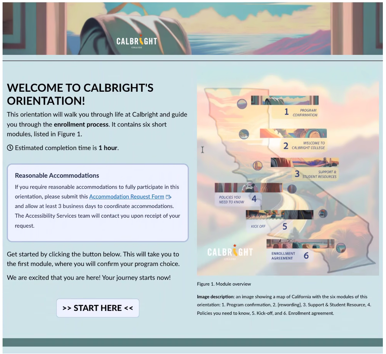
Enhancing navigation and engagement through a visual guidance system within an existing LMS structure
Problem
Students entering asynchronous online courses often encounter:
• fragmented navigation across modules
• unclear entry points into coursework
• inconsistent visual hierarchy
Within Canvas, these challenges are difficult to resolve structurally due to platform limitations.
Result: confusion, hesitation, and reduced engagement at the point of entry.
• fragmented navigation across modules
• unclear entry points into coursework
• inconsistent visual hierarchy
Within Canvas, these challenges are difficult to resolve structurally due to platform limitations.
Result: confusion, hesitation, and reduced engagement at the point of entry.
Constraints
• Existing LMS structure remained unchanged
• No custom development or navigation redesign
• Visual layer had to integrate within pre-existing course architecture
• Required stakeholder alignment across instructional teams
• No custom development or navigation redesign
• Visual layer had to integrate within pre-existing course architecture
• Required stakeholder alignment across instructional teams
Goal
Introduce a visual guidance system that:
• improves clarity of navigation without altering structure
• supports student orientation at key entry points
• increases engagement through consistent visual cues
Approach
Visual UX Layer (Augmentation, Not Replacement)
Rather than redesigning the LMS:
⚡️ Introduced a visual overlay system to support existing navigation
• enhanced entry points with visual signals
• reinforced structure through consistent imagery
• improved readability and orientation without changing flow
⚡️ Introduced a visual overlay system to support existing navigation
• enhanced entry points with visual signals
• reinforced structure through consistent imagery
• improved readability and orientation without changing flow
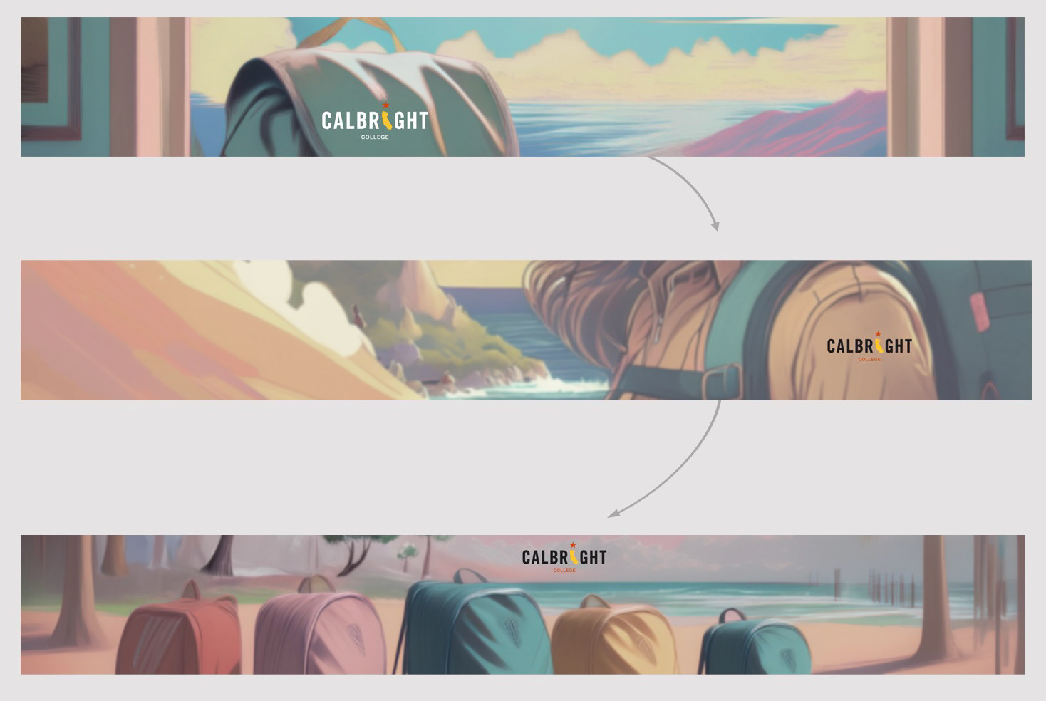
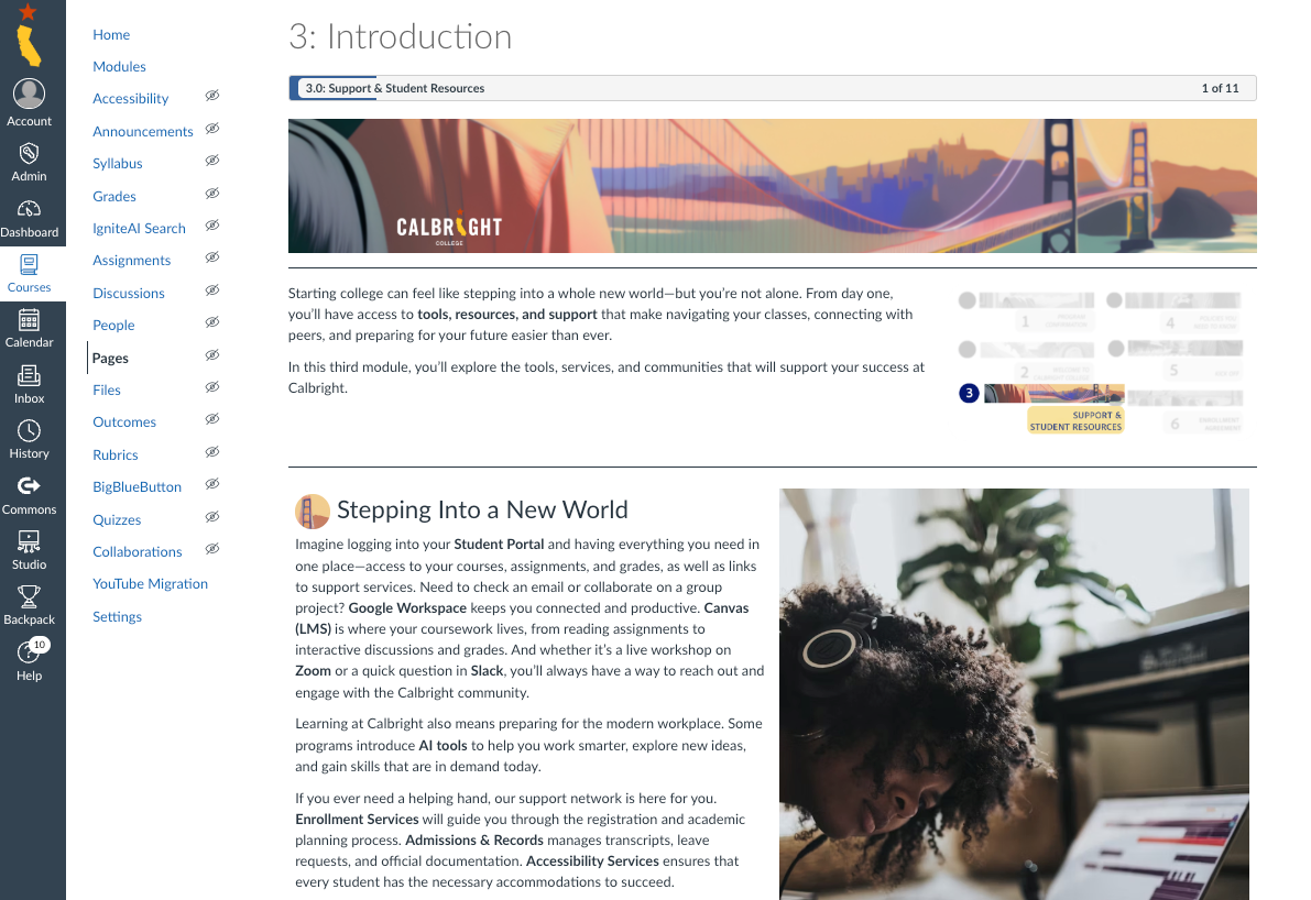
Narrative progression from entry to cohort, using a consistent visual metaphor to guide student orientation.
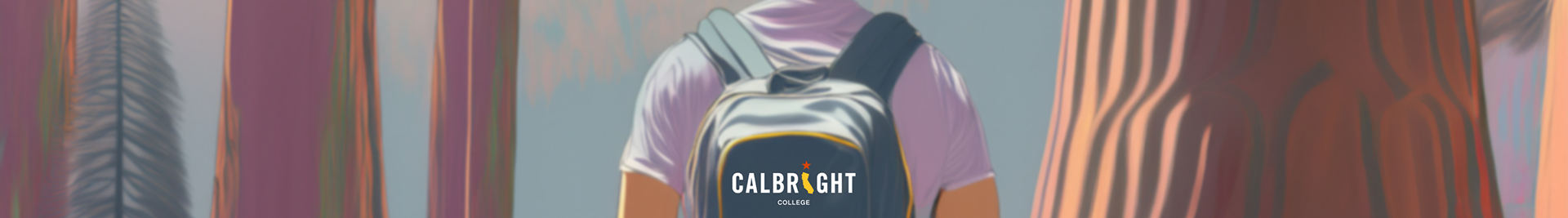
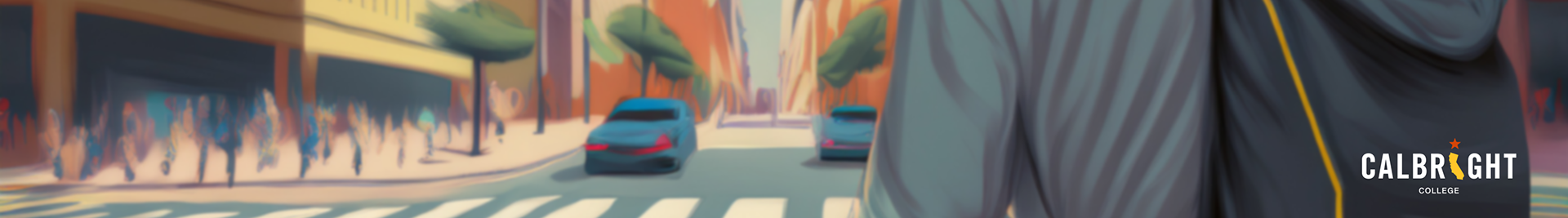
Backpack Concept (Visual Anchor System)
Developed a consistent visual metaphor:
⚡️the backpack as a symbol of student progression
• used as a recurring anchor across modules
• provided continuity within otherwise fragmented navigation
• created a recognizable entry cue for students
⚡️the backpack as a symbol of student progression
• used as a recurring anchor across modules
• provided continuity within otherwise fragmented navigation
• created a recognizable entry cue for students
Hierarchy & Engagement Design
• emphasized key navigation points visually
• reduced cognitive load through clear focal areas
• supported engagement through cohesive visual language
• reduced cognitive load through clear focal areas
• supported engagement through cohesive visual language
Narrative Layer: From Isolation to Cohort
Introduced a storytelling layer to connect the linear onboarding experience
Rather than treating onboarding as a series of isolated steps, the visual system follows a continuous narrative:
• the journey begins at the student’s desk (point of entry)
• progresses through movement across varied California environments
• resolves in a shared destination, where individual paths converge
• the journey begins at the student’s desk (point of entry)
• progresses through movement across varied California environments
• resolves in a shared destination, where individual paths converge
Why this matters
• addresses isolation in asynchronous learning environments
• reinforces a sense of belonging and cohort identity
• connects individual progress to a broader community
• reinforces a sense of belonging and cohort identity
• connects individual progress to a broader community
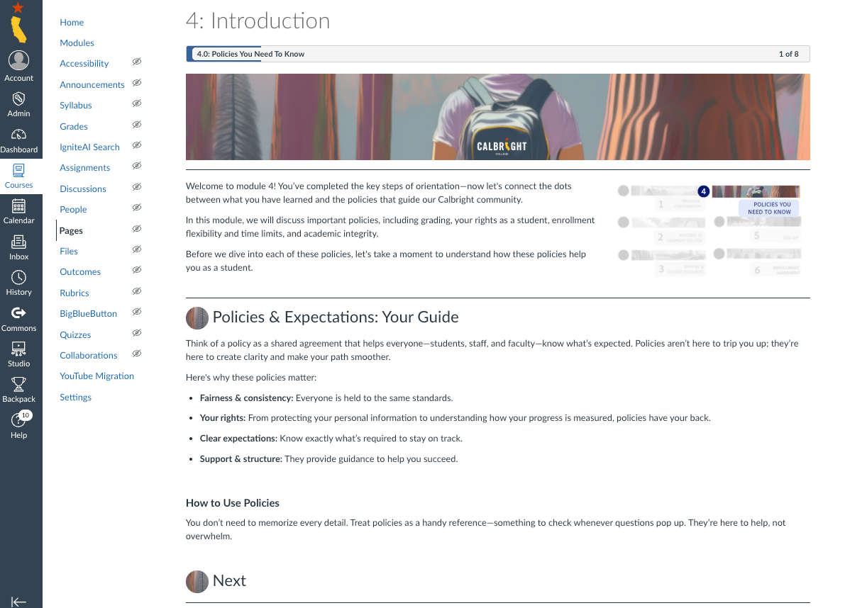
Sense of Place
The visual system reflects the geographic diversity of the student population:
• students depicted across different regions of California
• reinforces statewide access and inclusion
• grounds the experience in real-world context
• students depicted across different regions of California
• reinforces statewide access and inclusion
• grounds the experience in real-world context
Process
•Concept Development
Developed visual strategy and metaphor aligned with course structure
•Stakeholder Alignment
Presented concept and refined based on feedback
(Approved and supported at the VP level)
•Design Execution
Created banner system and visual assets
•Implementation Support
Integrated assets into existing Canvas course framework
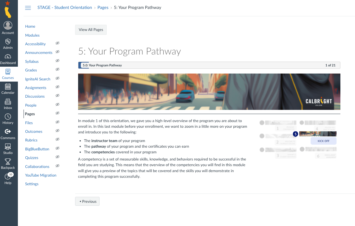
From Design to Implementation
Banner assets applied across live Canvas course environments

Role
• visual UX strategy and concept development
• design of system-level imagery and assets
• stakeholder communication and iteration
• alignment with LMS constraints
• design of system-level imagery and assets
• stakeholder communication and iteration
• alignment with LMS constraints
Outcome
• improved clarity at course entry points
• stronger visual consistency across modules
• increased student engagement through clearer cues
• positively received by stakeholders
• stronger visual consistency across modules
• increased student engagement through clearer cues
• positively received by stakeholders